So off I go ...
OK, first of all - the same thing applies to bw conversions from a capture side meaning no blown highlights or blocked shadows. You can shoot Zone System digitally but it's not necessary so long as you follow those two simple rules. For the photo I'm going to use as an example I actually got made fun of at the time I shot it by the only other dude who happened to be there with us (intruding on our solitude I might add but he was a nice enough fellow) when we were shooting - he said 'wow, you still use your grads!?' (graduated neutral-density filters just in case that wasn't obvious). To which I said of course and kept to myself shooting away. That way I was able to keep the brighter top-half of the image from blowing out while keeping all the detail in the darker foreground rocks and water. So let's start by looking at the raw capture and go from there.
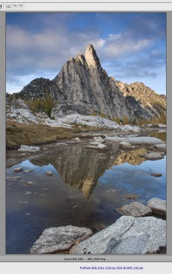 It looks pretty flat but that's OK - we're only just beginning. I knew I wanted to convert this to black-and-white but I'm not sure why. I thought maybe it would work. But basically I apply the same procedure up until the point of conversion that I do for images that I do not convert (so see that other post linked above for details if you're really interested but be prepared it's long and probably too-detailed) - adjust the scene with some adjustment layers to bring in detail that I want etc. etc. blah blah blah to get this -
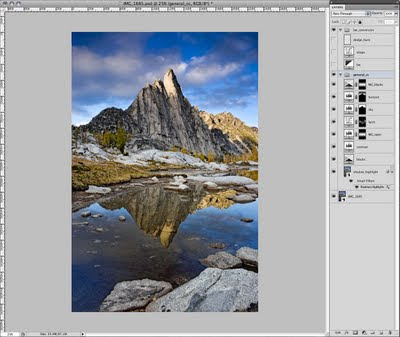 And then I convert. Well, not really - since in CS3 and beyond there is an adjustment layer called Black & White that you can use while keeping your image in RGB (the way they should be uploaded to Flickr BTW - if you create bw images to post to Flickr do not post greyscale images because Flickr assigns an RGB profile - probably sRGB I would assume - to it and the image then displays quite a bit darker than what you saw in Photoshop). Maximum flexibility, always.
So I just add a Black & White adjustment layer and adjust away -
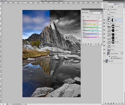 It's pretty straightforward - the tones you want to darken move the slider to the left. To lighten, to the right. So for the skies, for instance, I moved the Blues slider -60 to the left. But I wanted to make sure the yellow larch trees were light (akin to using a yellow filter with film at the time of capture, which would have also slightly darkened the sky) so I bumped that slider up quite a bit. And so on to get this look -
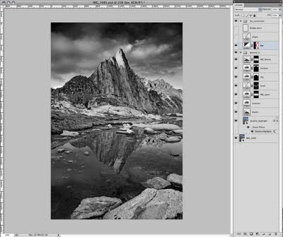 That's decent I guess. And well, you could stop there but then you wouldn't get such nice comments on Flickr. OK, I am totally kidding. But there are a couple more steps I go through in order to tweak out that depth of tone I was trying to explain earlier.
First - I pull in some shape post-conversion using a curves layer set to Luminosity (remember, we're still in RGB mode) like this -
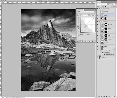 Leaving the 3/4 and shadow tones alone, but lightening the mids and 1/4-tones.
Then an old-school move from back in the darkroom days - dodge and burn. I understand the Dodge/Burn/Sponge tools in CS4 are much better so you do not have to do this workaround (because of a new feature called Protect Tones), but I'll describe the workaround because I have not thoroughly tested that out and the three people who actually read this and possibly find it useful might still be using CS3 or earlier.
So basically - create an empty layer above everything else and set the blending mode to Soft Light. Then choose the Brush tool and set the foreground/background colors to the default (black/white) by pressing 'D' (hitting 'X' swaps the foreground and background colors - useful in a second when you're swapping between dodging and burning). Black will burn; white will dodge. I tend to set the brush opacity pretty low - between 10-20% or the effect is too strong. You can of course do the brush at 100% and turn down the layer opacity, but that means the entire layer (so all your dodging/burning) will be the same opacity - whereas by tweaking the brush opacity rather than the layer you can dodge/burn some things in more than others etc.
Then just brush to your heart's desire - all the while pretending you are in a darkroom hunched over your enlarger in the dark with the stereo going upstairs and you're holding little metal wire hangers with pieces of cutout black paper attached or pieces of cardboard with various-sized holes cut out of them. And you get this -
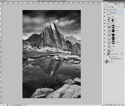 And so there you have it. Oh, but wait a minute - this is only black and white. No additional tones (to confirm just do all of those steps and then hover over the image with the Eyedropper set to measure RGB values - the R, G and B values are all the same indicating only a single tone). But we want depth of tone (different R, G and B values for a given pixel) so we need to do something else. But what?
And here is the key ... a little hidden mode buried in the other image modes called Duotone. No, I do not plan on printing this lithographically with two plates. But thinking outside the box - we can apply a duotone (or a tri- or quad-tone) look without having to print traditionally offset. So let's take a look at what this does.
The trick here is we need to convert to greyscale first in order to proceed to a duotone. But before we do, I save this RGB file with all the layers as a PSD! We cannot go back from a greyscale conversion, so that step is very important. I create a second file then that will be the duotone version.
So to do this I make sure that my greyscale profile is what I need because when you choose Image/Mode/Greyscale - Photoshop converts your image to a single grey channel based on the greyscale profile you have setup in your Color Settings. OK - I don't want to lose anyone on this little bit of color management stuff - but for my greyscale profile I just use whatever CMYK profile I have chosen. Photoshop takes the profile and only uses the luminosity data from it - very cool and it's a little secret I came across a year or so ago. Yes - you can use one of Photoshop's standard greyscale profiles like 'Dot Gain 20%' or 'Grey Gamma 2.2' and your results will probably be OK. But I am posting my procedure that tries to eak out the very best conversion and that little step is key so try this if you're up for it. And with that goal in mind it means using a custom CMYK profile I built (you can download profiles for the media you use or pay a little bit for someone to make them for you) for the Epson printer I use - and thus using the luminosity data from that profile for my greyscale profile. Make sense?
It's OK if it doesn't - just follow this: all you do is go to your Color Settings (Edit/Color Settings) and in the Grey: menu choose to Load Grey -
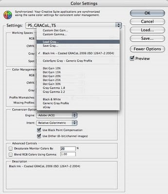 Don't panic if you don't see this option - you need to make sure to have already checked the More Options button on the right (it says Fewer Options in the screenshot above because I already checked it). Apparently, if you do that Photoshop assumes you know what you're doing here and gives you the ability to load your own profiles. Which is what we want to do. Then you browse out to wherever you saved your CMYK profile and choose it (on a Mac - the path is Your User or HD folder/Library/ColorSync/Profiles; on a PC, it's something awesome like C:\WINDOWS\system32\spool\drivers\color - just what is 'system32' anyway ... ?).
This works even if you do not have a custom CMYK profile. You can use any CMYK profile (and Photoshop has to have one so you're using one whether you know it or not - it might just be something like U.S. Web Coated SWOP V2 etc.). You will just need to know where to browse to find it and load it - on a Mac, also try HD (for your hard drive)/Library/Application Support/Adobe/Color/Recommended - I'm getting off course a bit and diving deeper into color management than I want at the moment so getting back on track ...
Photoshop ignores all but the Luminosity data (like I said) on the fly and you're done. Now you're ready to convert to greyscale. So do that. And once you do, the option for duotone becomes available in the Image/Mode/ menu so I choose that -
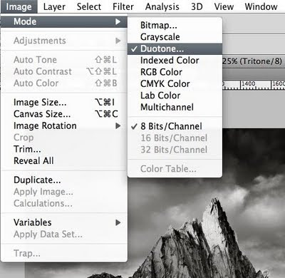 to open this window -
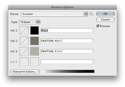 And yes - I actually created a tritone (but play around with a duotone and even a quadtone if you're interested). The whole point is adding depth of tone of course (have I said that already) - and for me - without really changing the overall tone of the image (like a selenium or sepia tone, for example). Of course you could do that by choosing cooler or warmer colors (respectively) for your additional tones, but my goal is just more depth of the existing tone so I choose neutral colors albeit ones that are slightly (ever so) on the warm side as I tend to prefer a slightly warmer print to a cooler one (but that is just me).
So to get to this point and choose your color(s), simply click on the color boxes to the left of the name box. This brings up the various libraries that Photoshop can use to spec an ink/tone for you (this is because duotones are supposed to be used to create a file with a certain number of channels/plates for printing on press). I use the Pantone Coated library but feel free to experiment. For those not familiar with the Pantone libraries - you'll see there are lots of colors from which to choose. If you were going for a selenium look you might choose a cool blue swatch like 294 C -
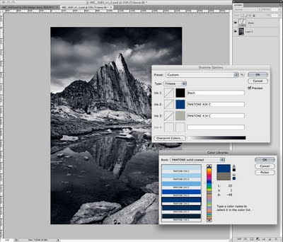 For Sepia, maybe 130 C. For a cool grey feel, 423 C or Pantone Cool Grey 7 C. There are also Pantone Warm Grey options. Lots and lots of options. But any of them in addition to the Black channel will give the image more depth of tone. The key is to choose a color that does not significantly add weight (or density, whatever you want to call it) to the image - requiring an adjustment be made to the duotone curves (the box to the left of the color box in the duotone window). Once you've chosen one color - try adding a third and possibly a fourth. And based on the colors you choose, you may or may not have to adjust the curves for the additional colors (I did slightly for the 414 C - taking out just a bit in the midtones and 10% in the shadows) -
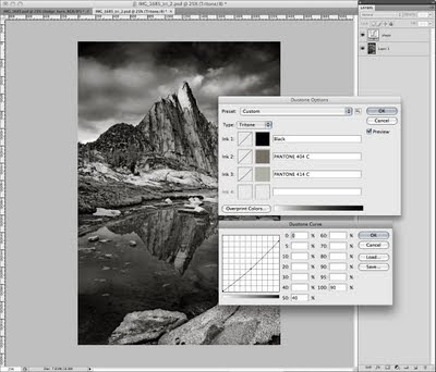 Warning: this can get complicated. So try to avoid it like I mentioned by choosing light enough colors. The way the Pantone library is set up is that each 'set' so-to-speak of seven colors is all the same Hue but have varying degrees of Lightness so once you land on a set of hues that you like, you can simply pick the one swatch of the seven that - when applied to your image - does not lighten or darken it in such a way that you would have to edit the curves. Little tip.
But if you do edit the curves - one thing that is very cool is that you can save those duotone options/curves by clicking on the little box to the right of the Preset name at the top of the duotone window. Choose Save Preset and save it somewhere (the default on a Mac is your user account/Library/Application Support/Adobe/Photoshop (version)/Presets/Duotones/ - sorry PC users, I avoid PCs like the plague and have absolutely no idea where Windows puts things like this - all I know is it is very likely not somewhere that is in the slightest bit intuitive like what it does with color profiles - OK I'm done I promise .... ). You can then load it by clicking that same little box for any images that you want to make into a duotone with those same presets. You can even make an action but this little procedure is fairly hands-on so even I haven't gone to that extent (that and I do not convert all that many images).
Well, we now have a duotoned (or more) image. The last thing that I did was add one more shape layer to pull out just a bit of weight in the midtones (ever-so-slight) -
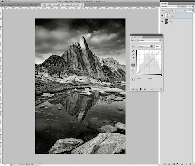 And then I am done -
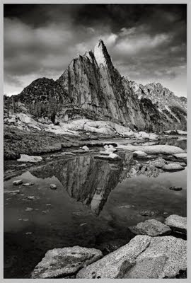 So I save this second file and add the word _duo or _tri or whatever to the filename and it stays in duotone mode. So I have the master RGB file, the saved duotone curves and the duotone file. For Flickr, there is one last step - convert back to RGB. So again, the only way to do so from a duotone-mode image is to go to the Image/Mode menu and choose RGB Color. So again, I make sure my RGB profile is what I want to convert to so I do not have to convert a second time after changing modes! In this case, since I will be uploading an RGB version to Flickr, I make sure my RGB working space is sRGB. Then I switch the mode (if the Merge warning dialog comes up because you have layers like I do - choose to merge). Then downsample so I am not uploading a hi-res to the web and done.
Printing is an entirely different subject.
The result when printed is not a print made from an enlarger through an analog process of filters and lightbulbs and smelly chemistry (all of which are good, mind you) - but it comes close. Awfully close - if anything, it just lacks that analog feel that cannot be described. But it has depth of tone - a success - more so than an image simply converted to black and white and left to be. And maybe this post was shorter than the other one. Or maybe not. So props to anyone who actually read this far (and without skipping to the very end to read this last sentence).
cheers


