Thursday, December 24, 2009

this world of light and shadow and time.

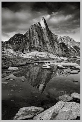
"Our job is to record, each in his own way, this world of light and shadow and time that will never come again exactly as it is today."
~ Edward Abbey

Back in the fall of 2006 I met Jeff in Yosemite all geared up with my new Mamiya RB67 and twenty-plus rolls of Ilford FP4+ film and a few filters excited to shoot the iconic scenes of Yosemite in medium-format. I had not been there for nearly ten years and had only photographed there in 35mm the last time I visited.

So I did.

Then I developed the films. And aside from maybe this shot, that was it. I was done.

Shortly after then I printed that plate in my darkroom, promptly framed it with a gallery mat in a nice frame, wrapped it up and stuffed it in a box which lives in my basement.

Then I just took digital snapshots. I did not shoot medium-format film. I did not try to print anything. Nothing. My reasoning of course was logical to me: everything had already been photographed. A million times. Probably more. And others had done it better so why bother? I knew in the back of my head that it was because I had set out to shoot these iconic scenes - iconic for a reason in that they had been photographed. A billion times. Probably more. But it did not seem to matter or permeate the malaise of just feeling like fine art landscape photography had already been done and in it there was nothing new to create or capture. Oh well.

But I have been excited about it again of late - ironically, quite for the very reason at which I used to scoff. Digital. I have really enjoyed shooting this year with my Canon 20D that I picked up off craigslist back in April or something. And converting to black and white (although somewhat laboriously) and printing on an Epson printer. I have recently framed my first couple of black and white photographs taken and processed and printed completely digitally.

But this is not a shout out to digital or even a comparison between that and working with film in a darkroom which is magical all in and of itself. But I came across this quote at a friend's house reading one of her books and it hit home what Abbey (who is a wonderful writer) said and the picture he paints with his words. That it is not the fact a photograph of Zion Canyon or Cathedral Peak or Mount Rainier or the Grand Canyon or any other of the wonderful and incredibly beautiful natural icons we find on this planet called Earth has already been taken - it is important for us, regardless, to record it in our own way the light and shadow and time and it all everything. With a digital SLR. Or a camera phone. Or a slightly-rusty old 4x5 view camera. Or a beautiful cherished Hasselblad freshly dusted off and pulled out of a closet.

And I will look at that frame of Zion Canyon above and remember standing there shivering in the cold under layers of down and fleece gloves and hand-stitched wool hat pressing the shutter waiting for the timer to expose the sensor. Holding my breath while the shadows crept up the illuminated canyon walls as time inched forward. Taking another frame. Maybe one would turn out. Maybe not. But I just stood there in complete awe watching the light change in that place and I know now what he was saying.

Abbey was right.

Friday, December 4, 2009

exogenesis.


Nevermind the lame video. This is quite something else. Incredible, in fact. The description that fits perfectly ~
'Symphonic Rock'
Although personally I like 'Classical Rock' as well but it sounds too much like 'classic rock' which is, um, quite different. This can be taken to a whole new level of course but what Matthew Bellamy has done here is most excellent. This is clearly inspired by a bit of Rachmaninov (or possibly Chopin) and - quite obviously - Gershwin. I think I already have what I need from other composers (Rachmaninov included of course), but thank you much Muse for the inspiration.

And for the time being - this is symphonic rock at its best.

Friday, November 27, 2009

Little Nutbrown Hare, who was going to bed, held on tight to Big Nutbrown Hare's very long ears.

He wanted to be sure that Big Nutbrown Hare was listening. "Guess how much I love you," he said. "Oh, I don't think I could guess that," said Big Nutbrown Hare.

"This much," said Little Nubrown Hare, stretching out his arms as wide as they could go. Big Nutbrown Hare had even longer arms. "But I love you this much," he said. Hmm, that is a lot, thought LIttle Nutbrown Hare.

"I love you as high as I can reach," said Little Nutbrown Hare. "I love you as high as I can reach," said Big Nutbrown Hare. That is very high, thought Little Nutbrown Hare. I wish I had arms like that.

Then Little Nutbrown Hare had a good idea. He tumbled upside down and reached up the tree trunk with his feet. "I love you all the way up to my toes!" he said. "And I love you all the way up to your toes," said Big Nutbrown Hare, swinging him up over his head.

"I love you as high as I can hop!" laughed Little Nutbrown Hare, bouncing up and down.

"But I love you as high as I can hop," smiled Big Nutbrown Hare–and he hopped so high that his ears touched the branches above.

That's good hopping, thought Little Nutbrown Hare. I wish I could hop like that.

"I love you all the way down the lane as far as the river," cried Little Nutbrown Hare. "I love you across the river and over the hills," said Big Nutbrown Hare.

That's very far, thought Little Nutbrown Hare. He was almost too sleepy to think anymore. Then he looked beyond the thornbushes, out into the big dark night. Nothing could be farther than the sky.

"I love you right up to the moon," he said, and closed his eyes. "Oh, that's far," said Big Nutbrown Hare. "That is very, very far." Big Nutbrown Hare settled Little Nutbrown Hare into his bed of leaves. He leaned over and kissed him good night.

Then he lay down close by and whispered with a smile, "I love you right up to the moon–and back."

speak in tongues.

Today's running song brought to me by Placebo ...


"We can build a new tomorrow today."

Friday, November 20, 2009

lecture 21.

I want to see this movie (even though I missed it at the SIFF) ...


Unequivocally. The. Greatest. Work. Of. Art. Of. All. Time.

The first sentence of my senior year English lit term paper (which I lightly titled Ludwig van Beethoven : Symphony 9 in D minor, Opus 125, the "Choral" : The Celebration of the Fraternity of Mankind : An Historical Outlook and Critical Analysis of Beethoven's Greatest Work - and no, I am not kidding) reads ~
Ludwig van Beethoven's Ninth Symphony in D minor, the "Choral," his one hundred and twenty-fifth work, is and will always remain his greatest, most monumental gift to all mankind.
The first sketches of what were to eventually become the first movement of the Ninth Symphony appear on loose leaves written during the last months of 1817 and the first months of 1818 I went on to write in the first few paragraphs. In typical Beethoven fashion (he constantly re-wrote and re-worked music on scraps of paper or the walls of wherever he happened to be living at the time) he was unhappy with and unconvinced of the rightness of the choral finale even after the first performance, and he meant to write a fresh fourth movement - one without voices. Thankfully he never followed through.

There is a quote pulled out of the pages and pages and pages I scrawled for my lit professor (who was herself - as it turned out - an ardent admirer of Beethoven) that I noticed re-reading this tonight ~
"Of all single works of art, of all passages in a work of art, the first subject of the first movement of Beethoven's Ninth Symphony has had the deepest and most profound influence on later music."
It begins quietly. Inaudibly in fact. Pianissimo fifths, subdominant and dominant in the key of D minor. Gradually they quicken. And build. And pile into a colossal wave of a descending D minor triad - the most powerful and suspenseful opening of any piece of music ever written.

And so on. And so on I write. I scrawled notes in the margins of the Kalmus score I used to study the themes and tempos and orchestrations and counterpoint that Beethoven wove in this most intrinsic work of art some of the pages now fragile and torn. I would sit in my bedroom headphones on following along to the music with the score flipping the pages furiously during the passages of quick tempo. My dad had a recording on CD that I borrowed and never gave back of Zubin Mehta conducting the New York Philharmonic in which I was convinced was the perfect performance and no other even came close to comparing (I am still convinced of that to this day).

***

I was eighteen. I'd be curious to see - if I rewrote this paper now - how my perspective would change. Not in the rightness of my contention that it is and will always remain the greatest work of art in all of history. But more so my analysis - not so much of the theory and counterpoint of the work - but of the background to the work (of which I did not touch in my senior year of high school). Snippets that were brought up in that (albeit, somewhat bizarre) trailer. About how in 1814 Beethoven's deafness fully fell on him and in those following years - could anyone imagine a greater loneliness?

Beethoven was shunned. He was scoffed at and ridiculed. He was an oaf at times. He was also more passionate than any I can imagine (um, just take one listen to his Piano Sonata No. 14 in C-sharp minor "Quasi una fantasia"). He loved women deeply (at least one in particular all the way up to his death - I would refer you back to that sonata which was written for her) but none returned the sentiment. And not at all least he - a composer, arguably the greatest composer of all time ... went deaf.

Why - with so much despair - did he not just withdraw the final ounce within himself? Concede to his deafness given all that he had already composed? Simple. He said it himself to his most prolific student (Carl Czerny, who went on to become a very accomplished pianist himself) ~
"I have never thought of writing for reputation and honor. What I have in my heart must [get] out; that is the reason why I compose."
He was not finished.

From out of the depths of his despair he created this symphony which is likely more recognizable to more people on this planet than any other piece of music ever written, recorded or performed. A piece of music that exudes every conceivable human emotion - from the deepest hopelessness to the most abundant joy and exuberance. It resounds with Schiller's words of bringing together all of mankind in hope (perhaps and not coincidentally the official antonym for dispair) and a kinship that strikes something deep and profound within all of us. We rise up (metaphorically, even) as the fourth movement - Presto allegro ma non troppo - comes to a crashing finale and the final words are sung fortissimo at the top of the chorus' lungs ~
"Freude schöner Götterfunken!"
(translated "Joy, beautiful spark of God!")

It is of things like that I would be interested in re-examining - attempting not to bias it too much with my own personal saga of sorts but at least to dig deeper (if only for myself) into more of the meaning of this - Beethoven's greatest work.

***

And lastly - an interesting and wholly modern bit about the Ninth: when the compact disc was being designed, there were two competing designs - one from Philips and the other from Sony. Both companies disputed each other over what should be the diameter of the disc. But someone at Philips argued - and ultimately prevailed - that the disc should be able to contain a single performance of Beethoven's Ninth (the longest known recording was seventy-four minutes by Wilhelm Fürtwangler of which I will not get into mainly because Fürtwangler's interpretations were not true to Beethoven's metronome markings but I digress), thus requiring a final 12cm diameter, the standard used today (and they hold exactly seventy-four minutes of music).

Friday, November 6, 2009

the sacrifice.

Watched The Insider for the first time a couple of weeks ago. Never knew it was a Michael Mann film. It was good of course. It was Michael Mann. Even more so because Lisa Gerrard did the soundtrack which I am now listening to and this song is quite incredible. Yes quite incredible. Yes quite incredible.

Thursday, November 5, 2009

uprising.

From the official MUSE youtube channel the first single.


Evidently the theme song for the remake V miniseries. Wow - I remember that from watching it as a kid. Not sure I'll attempt to watch the remake but the song is good and it is MUSE and I will be downloading the album The Resistance and will be seeing them live again when they come to Seattle.

Thursday, October 29, 2009

the anatomy of a conversion.

So a contact of mine left a comment on a photo in my Flickr stream that said something like 'I don't know how you achieved this result but this will be my sort of baseline for all my future BW works.' I thought that was nice. But also thought hmm, maybe I should post another Photoshop entry (uh, I'll try to make it not as long as the last one) - only this time go into the details about just how I get a black-and-white conversion out of a color image. The process I developed has been in the works for a while and gets updated with each new version of Photoshop because the tools and means to an end change of course so it will continue to evolve but I can detail the jist of it here and maybe someone will find it useful. Granted - it is not a quick press-a-button-and-you're-done process so takes a bit of patience, but the goal of it is to recreate a digital print (from a digital file on a digital printer like an Epson Ultrachrome inkjet) that gets close to the depth of tone that a print made on true RC or fiber photographic paper developed in a darkroom can. And of course this is just the image creation side of it - I am not going to even touch the printing part here.

So off I go ...

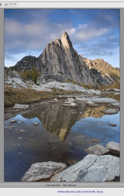
OK, first of all - the same thing applies to bw conversions from a capture side meaning no blown highlights or blocked shadows. You can shoot Zone System digitally but it's not necessary so long as you follow those two simple rules. For the photo I'm going to use as an example I actually got made fun of at the time I shot it by the only other dude who happened to be there with us (intruding on our solitude I might add but he was a nice enough fellow) when we were shooting - he said 'wow, you still use your grads!?' (graduated neutral-density filters just in case that wasn't obvious). To which I said of course and kept to myself shooting away. That way I was able to keep the brighter top-half of the image from blowing out while keeping all the detail in the darker foreground rocks and water. So let's start by looking at the raw capture and go from there.

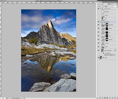
It looks pretty flat but that's OK - we're only just beginning. I knew I wanted to convert this to black-and-white but I'm not sure why. I thought maybe it would work. But basically I apply the same procedure up until the point of conversion that I do for images that I do not convert (so see that other post linked above for details if you're really interested but be prepared it's long and probably too-detailed) - adjust the scene with some adjustment layers to bring in detail that I want etc. etc. blah blah blah to get this -

And then I convert. Well, not really - since in CS3 and beyond there is an adjustment layer called Black & White that you can use while keeping your image in RGB (the way they should be uploaded to Flickr BTW - if you create bw images to post to Flickr do not post greyscale images because Flickr assigns an RGB profile - probably sRGB I would assume - to it and the image then displays quite a bit darker than what you saw in Photoshop). Maximum flexibility, always.

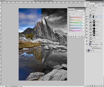
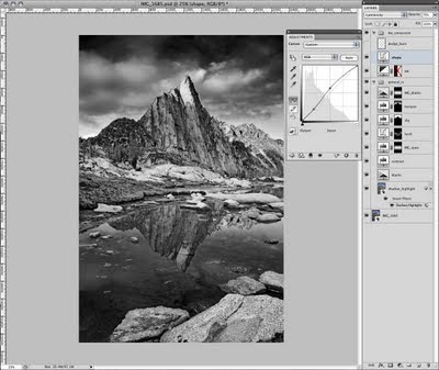
So I just add a Black & White adjustment layer and adjust away -

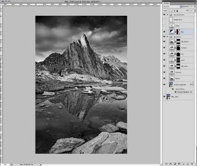
It's pretty straightforward - the tones you want to darken move the slider to the left. To lighten, to the right. So for the skies, for instance, I moved the Blues slider -60 to the left. But I wanted to make sure the yellow larch trees were light (akin to using a yellow filter with film at the time of capture, which would have also slightly darkened the sky) so I bumped that slider up quite a bit. And so on to get this look -

That's decent I guess. And well, you could stop there but then you wouldn't get such nice comments on Flickr. OK, I am totally kidding. But there are a couple more steps I go through in order to tweak out that depth of tone I was trying to explain earlier.

First - I pull in some shape post-conversion using a curves layer set to Luminosity (remember, we're still in RGB mode) like this -

Leaving the 3/4 and shadow tones alone, but lightening the mids and 1/4-tones.

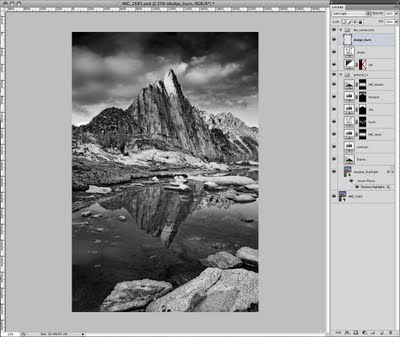
Then an old-school move from back in the darkroom days - dodge and burn. I understand the Dodge/Burn/Sponge tools in CS4 are much better so you do not have to do this workaround (because of a new feature called Protect Tones), but I'll describe the workaround because I have not thoroughly tested that out and the three people who actually read this and possibly find it useful might still be using CS3 or earlier.

So basically - create an empty layer above everything else and set the blending mode to Soft Light. Then choose the Brush tool and set the foreground/background colors to the default (black/white) by pressing 'D' (hitting 'X' swaps the foreground and background colors - useful in a second when you're swapping between dodging and burning). Black will burn; white will dodge. I tend to set the brush opacity pretty low - between 10-20% or the effect is too strong. You can of course do the brush at 100% and turn down the layer opacity, but that means the entire layer (so all your dodging/burning) will be the same opacity - whereas by tweaking the brush opacity rather than the layer you can dodge/burn some things in more than others etc.

Then just brush to your heart's desire - all the while pretending you are in a darkroom hunched over your enlarger in the dark with the stereo going upstairs and you're holding little metal wire hangers with pieces of cutout black paper attached or pieces of cardboard with various-sized holes cut out of them. And you get this -

And so there you have it. Oh, but wait a minute - this is only black and white. No additional tones (to confirm just do all of those steps and then hover over the image with the Eyedropper set to measure RGB values - the R, G and B values are all the same indicating only a single tone). But we want depth of tone (different R, G and B values for a given pixel) so we need to do something else. But what?

And here is the key ... a little hidden mode buried in the other image modes called Duotone. No, I do not plan on printing this lithographically with two plates. But thinking outside the box - we can apply a duotone (or a tri- or quad-tone) look without having to print traditionally offset. So let's take a look at what this does.

The trick here is we need to convert to greyscale first in order to proceed to a duotone. But before we do, I save this RGB file with all the layers as a PSD! We cannot go back from a greyscale conversion, so that step is very important. I create a second file then that will be the duotone version.

So to do this I make sure that my greyscale profile is what I need because when you choose Image/Mode/Greyscale - Photoshop converts your image to a single grey channel based on the greyscale profile you have setup in your Color Settings. OK - I don't want to lose anyone on this little bit of color management stuff - but for my greyscale profile I just use whatever CMYK profile I have chosen. Photoshop takes the profile and only uses the luminosity data from it - very cool and it's a little secret I came across a year or so ago. Yes - you can use one of Photoshop's standard greyscale profiles like 'Dot Gain 20%' or 'Grey Gamma 2.2' and your results will probably be OK. But I am posting my procedure that tries to eak out the very best conversion and that little step is key so try this if you're up for it. And with that goal in mind it means using a custom CMYK profile I built (you can download profiles for the media you use or pay a little bit for someone to make them for you) for the Epson printer I use - and thus using the luminosity data from that profile for my greyscale profile. Make sense?

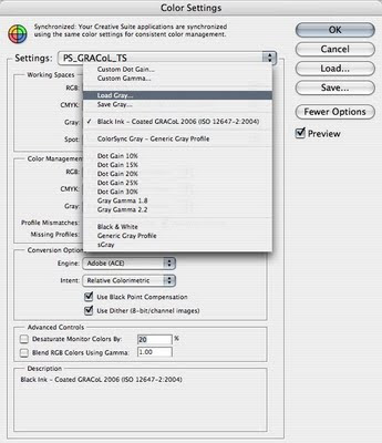
It's OK if it doesn't - just follow this: all you do is go to your Color Settings (Edit/Color Settings) and in the Grey: menu choose to Load Grey -

Don't panic if you don't see this option - you need to make sure to have already checked the More Options button on the right (it says Fewer Options in the screenshot above because I already checked it). Apparently, if you do that Photoshop assumes you know what you're doing here and gives you the ability to load your own profiles. Which is what we want to do. Then you browse out to wherever you saved your CMYK profile and choose it (on a Mac - the path is Your User or HD folder/Library/ColorSync/Profiles; on a PC, it's something awesome like C:\WINDOWS\system32\spool\drivers\color - just what is 'system32' anyway ... ?).

This works even if you do not have a custom CMYK profile. You can use any CMYK profile (and Photoshop has to have one so you're using one whether you know it or not - it might just be something like U.S. Web Coated SWOP V2 etc.). You will just need to know where to browse to find it and load it - on a Mac, also try HD (for your hard drive)/Library/Application Support/Adobe/Color/Recommended - I'm getting off course a bit and diving deeper into color management than I want at the moment so getting back on track ...

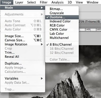
Photoshop ignores all but the Luminosity data (like I said) on the fly and you're done. Now you're ready to convert to greyscale. So do that. And once you do, the option for duotone becomes available in the Image/Mode/ menu so I choose that -

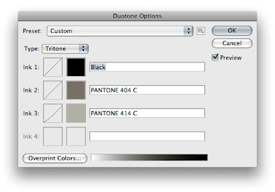
to open this window -

And yes - I actually created a tritone (but play around with a duotone and even a quadtone if you're interested). The whole point is adding depth of tone of course (have I said that already) - and for me - without really changing the overall tone of the image (like a selenium or sepia tone, for example). Of course you could do that by choosing cooler or warmer colors (respectively) for your additional tones, but my goal is just more depth of the existing tone so I choose neutral colors albeit ones that are slightly (ever so) on the warm side as I tend to prefer a slightly warmer print to a cooler one (but that is just me).

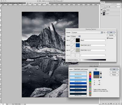
So to get to this point and choose your color(s), simply click on the color boxes to the left of the name box. This brings up the various libraries that Photoshop can use to spec an ink/tone for you (this is because duotones are supposed to be used to create a file with a certain number of channels/plates for printing on press). I use the Pantone Coated library but feel free to experiment. For those not familiar with the Pantone libraries - you'll see there are lots of colors from which to choose. If you were going for a selenium look you might choose a cool blue swatch like 294 C -

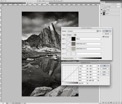
For Sepia, maybe 130 C. For a cool grey feel, 423 C or Pantone Cool Grey 7 C. There are also Pantone Warm Grey options. Lots and lots of options. But any of them in addition to the Black channel will give the image more depth of tone. The key is to choose a color that does not significantly add weight (or density, whatever you want to call it) to the image - requiring an adjustment be made to the duotone curves (the box to the left of the color box in the duotone window). Once you've chosen one color - try adding a third and possibly a fourth. And based on the colors you choose, you may or may not have to adjust the curves for the additional colors (I did slightly for the 414 C - taking out just a bit in the midtones and 10% in the shadows) -

Warning: this can get complicated. So try to avoid it like I mentioned by choosing light enough colors. The way the Pantone library is set up is that each 'set' so-to-speak of seven colors is all the same Hue but have varying degrees of Lightness so once you land on a set of hues that you like, you can simply pick the one swatch of the seven that - when applied to your image - does not lighten or darken it in such a way that you would have to edit the curves. Little tip.

But if you do edit the curves - one thing that is very cool is that you can save those duotone options/curves by clicking on the little box to the right of the Preset name at the top of the duotone window. Choose Save Preset and save it somewhere (the default on a Mac is your user account/Library/Application Support/Adobe/Photoshop (version)/Presets/Duotones/ - sorry PC users, I avoid PCs like the plague and have absolutely no idea where Windows puts things like this - all I know is it is very likely not somewhere that is in the slightest bit intuitive like what it does with color profiles - OK I'm done I promise .... ). You can then load it by clicking that same little box for any images that you want to make into a duotone with those same presets. You can even make an action but this little procedure is fairly hands-on so even I haven't gone to that extent (that and I do not convert all that many images).

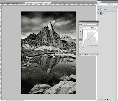
Well, we now have a duotoned (or more) image. The last thing that I did was add one more shape layer to pull out just a bit of weight in the midtones (ever-so-slight) -

And then I am done -

So I save this second file and add the word _duo or _tri or whatever to the filename and it stays in duotone mode. So I have the master RGB file, the saved duotone curves and the duotone file. For Flickr, there is one last step - convert back to RGB. So again, the only way to do so from a duotone-mode image is to go to the Image/Mode menu and choose RGB Color. So again, I make sure my RGB profile is what I want to convert to so I do not have to convert a second time after changing modes! In this case, since I will be uploading an RGB version to Flickr, I make sure my RGB working space is sRGB. Then I switch the mode (if the Merge warning dialog comes up because you have layers like I do - choose to merge). Then downsample so I am not uploading a hi-res to the web and done.

Printing is an entirely different subject.

The result when printed is not a print made from an enlarger through an analog process of filters and lightbulbs and smelly chemistry (all of which are good, mind you) - but it comes close. Awfully close - if anything, it just lacks that analog feel that cannot be described. But it has depth of tone - a success - more so than an image simply converted to black and white and left to be. And maybe this post was shorter than the other one. Or maybe not. So props to anyone who actually read this far (and without skipping to the very end to read this last sentence).

cheers

Monday, October 19, 2009

so the story goes.

Ten years ago now I think. Without a doubt the most ridiculous financial decision I have ever made. I could not explain at the time why without a place to put it living in apartments making pennies an hour twenty years old completely out of nowhere I talked myself into the idea that I must have a grand piano. And so after scrawling calculations on scraps of paper and more scraps of paper adding up and subtracting from and figuring out how to stretch every last penny maybe going without food so that I could sit at a grand piano and bang away annoying all within earshot I began The Search. This entailed Friday nights raining autumn in full swing driving from Tacoma to Seattle and all points in between including the Bösendorfer dealer (Austrian like W.A. Mozart weak and without real power) in Portland visiting every piano dealer I could find. Some took me seriously. Others told me to quiet down me hammering chords that there were lessons going on in the back what is this twenty-year-old doing looking at the grand pianos anyhow surely we could interest him in a nice electronic keyboard that one there in the window.

And then one afternoon I found myself wandering into the Helmer's Music in Tacoma in search of the six-foot version of the five-seven grand piano I had almost nailed my search down to that they had up in Federal Way. "Check out the six-footer before you buy" the guy up there told me and sent me south. And so I wandered the store from one far corner to the other of course because I had to at last finding the six-foot Weber and having a go on it. Wrapping up on it there in the back corner a mahogany 5'9" piano impeccably beautiful and so I snuck up to it for a closer look. Hmm ... "C. Bechstein" it said on the fallboard. Never heard of it. Pianoforte-Fabrick von C. Bechstein Berlin graced the soundboard. German. Beethoven. Real power. Maybe? And so I took a seat at the bench and held my breath and played exactly three chords (I even remember which ones). And that was it. I was done for.

I must have a Bechstein grand piano before I die I told myself in an instant before exhaling still sitting at the bench running my fingers across the keys.

Too bad for me scraping pennies together to pony up for a Korean-made Weber (just as good if not better sounding than the Japanese Yamahas pricier if only for their name and only the five-seven at that cos I could not hear enough of a difference in the five extra inches to scrape up a few grand more) that this particular Bechstein had a pricetag of $93,000. But it did not matter. I would own one someday. Or so the story goes.

And so completely by accident today I came across this photographic series by Robert Matzken. I of course was drawn to the incredible photography–the best I have ever seen of a Bechstein piano. Or any piano for that matter. Ever. But also his description, where he says ~
Salon Grand Piano from 1902, with the Autumn sun occasioning a warm light with all sorts of colour reflections on the faded black polish.
Wonderful. The old ones–like this one from the early twentieth century and even the late nineteenth century–are the most rare and the most precious and the most beautiful. The series is entitled C. Bechstein Flügel and it is gorgeous. And I thank him for sharing.

idea.

So the way it seems to work is some night late always I stumble over to the Bechstein and blurt out some random idea that comes to me out of nowhere. It is always an enormous idea in my head but translated to two hands on a piano recorded in Logic to hold onto and rework and assemble seems at times to me lame in comparison. But I remember this idea. It is fragmented and torn and there are notes misplayed (many notes misplayed) and mistimed (much of it mistimed) but I do not edit these first attempts at an idea in case something never intended (as in the whole of it the playing completely unintentional) might be erased and better left kept. And always a voice in my head even when the lyrics are not written always trying to rise above the piano and the orchestra and the band everything colliding in my head. Sometimes it seems there is no piano large enough and surely I am not nearly good enough to express it all. I have no idea what I was thinking as I played this. I have no idea if the final song will sound anything like this original idea but I will always have it to remember. I have no idea but am done now.


File linked here if the player does not work.

Monday, October 5, 2009

"There have been joys too great to be described in words, and there have been griefs upon which I have not dared to dwell; and with those in mind I say, Climb if you will, but remember that courage and strength are nought without prudence, and that a momentary negligence may destroy the happiness of a lifetime. Do nothing in haste; look well to each step; and from the beginning think what may be the end."
~ Edward Whymper, The Ascent of the Matterhorn, 1865

Whymper wrote about the tribulations he experienced on the ill-fated first ascent of the Matterhorn (the last so-called 'Great Problem' amongst the Alps before the next generation of climbers turned their attention to the ridges and direttissimas and then the north faces) in which he watched in horror as four men on his team fell four thousand feet down the most difficult mountain in all of Europe to their certain deaths.

But maybe his writing rings true in a greater context; certainly beyond the act of climbing mountains, in it I think perhaps a more profound meaning can be found. Particularly the last phrase. Particularly that last phrase. I can hear it repeating in my head as I commit it to memory ...

Monday, September 14, 2009

mp3_002.

So some time ago I posted an MP3. I think it lasted a few hours. Then I deleted it. And now I am trying again. Maybe it will last longer than a few hours. The one thing this has going for it is that it is a complete song. Not just a clip. Not a final mix by any means though either. But a complete song. Needs a singer. Though I hear his voice in my head. A tenor. Rising higher and higher and louder and louder during the crescendo of a chorus no way I can attempt it. Mostly recorded one night a week or two ago. Finished late tonight because everything of any substance always happens late it seems. Nothing more than a snapshot of something I fumbled on the piano one day a couple of months ago now digitized.


File linked here if the player does not work in some browser or other ...

Friday, September 11, 2009

night sky monopoly.

Yep, it has been a long time since I have played this game. But this new version that we are apparently shooting here in the studio caught my attention ~

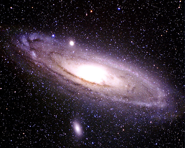
I will be purchasing it and playing it. Boardwalk is the Milky Way Galaxy, and Park Place is Andromeda. Now how cool is that?

As a kid, I have memories of playing this and kicking *ss. I also recall my poor mom, who apparently had zero knack for this one (but don't tempt her with a game of Trivial Pursuit) and would constantly lose. As in she could not win. Ever. So she never played again.

Anyways, thought this was fun. If only one of the playing pieces was the JWST (especially since it looks so rad) ...

Sunday, September 6, 2009

the climber.

We were browsing the wines at the local Top Food (at which I never shop) on our ever-present quest to find 'The Prisoner' somewhere local without resorting to a trip to Portland (which is never a bad thing and certainly not if for the only reason of picking up a bottle of this most fantastic wine) when I spotted this amongst the selection of reds ~

Who would have thought there would actually be a wine called 'The Climber?' I have not yet broken into it but am expecting it to be fabulous (with that sort of theme it has to be!). Clif Bars and red wines.

Oh, and along those lines–who also would have thought Platypus would make–along with their selection of various hydration products–a wine preserver? I noticed this little contraption when I was at REI the other night picking up last-minute items for a climb that had to be postponed due to crap weather this weekend. Oh well. It was not all in vain.

And one last little note–of all wines, this one should have a screw top.

cheers

Saturday, September 5, 2009

a phrygian sky.

The moonlight it was dancing on the waves out on the sea
The stars of heaven hovered in a shimmering galaxy

Thursday, August 27, 2009

the anatomy of an image.

Okay I have never done this before and this is admittedly sort of giving away some secrets but maybe someone who reads this (does anyone actually read this? quien sabe) might find it helpful. I have certainly written enough blogs (or maybe not) for a group on Flickr that kind of discuss in some detail various aspects of color management and using it in Photoshop and raw workflows and such. And apparently I'm doing a presentation at the worldwide PIA Color Management Conference in Phoenix this year on color-managed raw workflows so this ties in nicely and maybe I'll just flash up this blog post at the conference and take off for Zion.

But anyways, I'm going to dissect a recent photo I took when J and I backpacked to Cathedral Peak a month ago on our annual pilgrimage-of-a-summer-vacation to the hot and sunny state of California to bask in the Sierras. Maybe this will be useful to see how much (but really how little) is done to an image to take it from being 'eh' to hopefully at least slightly more than 'eh.'

First of all, I still have to blog about our vacation. But just for this post I am going to throw out there I have wanted to backpack to Cathedral for a few years namely because it is just an über-picturesque peak. It's weird how certain mountains are just beautiful while others are just, well, not. Cathedral is beautiful. Probably one of the most spectacular peaks in the Sierras–at least in my humble opinion, but I have far from traveled throughout the Sierras so many might disagree. Anyways. It is.

So the story goes that on this trip (and this is the short version) I left the rainfly back in Oliver's trunk gambling that it would not rain. A thunderstorm overtook Cathedral that afternoon. I set up the tent as far under a clump of trees as I could until it (the storm, not the tent thankfully) blew over. We stayed mostly dry. The storm broke up around five in the afternoon. The sky was full of, well, quite incredible clouds. The light was for lack of a better term, um, stellar. About seven J and I took off to a) find a good spot for reflection shots of Cathedral for later in the evening and then b) scramble up eight- or nine-hundred feet along a ridge that overlooked Cathedral Lake, Tenaya Lake and the high Sierra in every direction. I took some pictures of the mountains and of J. Like this. And this. J took one. I asked him after why he didn't take more!? He didn't really know. Maybe he was too busy climbing. After that bit of fun, we hurried back down to set up the tripod and await the show.

Uh, and what a show. It's funny looking through my collection on Bridge cos you can see in the tiny thumbnail filmstrip how the light went from good to better to best. Or from blue to pink to purple. When it was all done, J and I wound our way back around the trail to our campsite to sit on a rock and watch as the light on Cathedral faded more and more to just about completely dark before we made our way back to the tent. It was an incredible evening and one I know I will not and hopefully he will not soon forget.

But anyways, so onto the image at hand. For which I just aimed at Cathedral and pointed. I had nothing to do with the light. I swear. And just a couple of things to keep in mind before I dive into it:

• I try to keep my Photoshop work fairly consistent for my landscapes and at a minimum because ...
• a good shot requires a, um, good shot–which is just to say shoot it right when you're there so you start with a good file that just needs some slight tweaking like making sure nothing is blown out (or only slightly blown out because you can recover some of it in Photoshop)
• shoot in raw–yes, do not shoot JPEGs if you really care and your camera can shoot raw (I'll attempt to show there's lots of things you can do in Camera Raw that might be surprising)
• for morning/evening/reflection shots there is little chance of actually not blowing something out or blocking up shadows without either a) using graduated neutral density filters (as I did for this shot) or b) shooting multiple exposures–I do not attempt to shoot multiple exposures (bracketing in-camera) because things tend to move (like the water in this shot might have)
• if you don't have one already go out and get a polarizer filter–there, I said it–and use it for just about every shot you take, especially of water and skies (here, you can see the bottom of the lake because the polarizer cuts through the glare off the water and really brings out detail you would never get without one–the current version of Photoshop cannot create the bottom of Cathedral Lake)
• use adjustment layers–never ever ever make an adjustment without one

Okay, that was way too preachy. I take it all back. Do and shoot as you please of course, but that's just what I do and did for this shot to get what I got. But like I said I just point and shoot. Sometimes get lucky.

So onward we go, starting with the original capture (meaning not yet adjusted in Adobe Camera Raw–ACR from here on out) and histogram (click on any of the following images to open a larger version) -

Notice the composite (RGB) diagram at top–nothing blown out, nothing plugged up. I shot this with a circular polarizer and a 0.9 (3-stop) graduated soft-edge neutral density filter (well, actually 0.3- and 0.6-stop filters combined) on a tripod. And since I'm getting this granular, what the heck–it was shot at f11 for 0.5 seconds at ISO 100 using a Canon IS 18-55mm lens on a Canon 20D (in raw mode of course, no extra JPEG). My workflow then consists of downloading all my .CR2 raw Canon files to a folder and then pointing the Adobe DNG Converter to convert them all to open-source .dng files (as opposed to the lame proprietary Canon files). Once they're converted, I move the .dng files into my folder hierarchy on my server which more or less mirrors the folder structure the 20D creates (a hundred files per folder–like 0400-0499 etc.). The server is backed up daily to a large firewire drive with the help of SuperDuper! (the best Mac backup software hands-down). I dump the .CR2 files because I'm no pro and could never think of a reason to keep them but I can see why someone might. I then go through Bridge and choose my 'selects' by marking them with a certain number of stars (uh, this one originally got 3 but was bumped up to 4 after I finished editing it). Then I open the .dng into ACR and start–this is what it looks like after that little journey through ACR which I will explain in a moment-

A bit better. Basically, I have just optimized the capture. An important element here and you might notice the icon of the IMG_0943 layer with the little paper-with-folded-over-corner? That is a Smart Object icon and a key component of my workflow. In CS3, there is a setting you can select in ACR that opens all files as Smart Objects by clicking on the Workflow Options link at the bottom of the ACR window. Turn it on. And leave it on. It rules. And what it allows you to do is double-click that icon which then takes you back into ACR to make any further adjustments necessary. Flexibility to any workflow is key, and Smart Objects are the epitome of flexibility. But what I did in ACR–starting with the Basic tab–is as follows (and I'll just move through the different tabs from left to right, basically the workflow I would recommend and why it is set up the way it is) -

I have noticed that since Canon cameras rule they require no adjustment of the temp and tint unless you want to be creative. But I don't usually touch them. What I do is adjust the exposure to make sure my histogram stretches from end to end as can be seen in either picture above or below.

I then adjust the parametric tone curve like that shown above. The point curve is leftover from ACR versions past so I never touch it. Parametric = much more powerful. You can move the triangles at the bottom to refine what ACR adjusts as shadows, darks, lights and highlights. I tend not to mess much with the highlight end of the spectrum because I want to maintain detail in clouds and such.

Okay, the Detail tab above is key. Now it can be debated where and when to do your sharpening and I have been using and testing versions of ACR since 1.0 and the various sharpening filters in Photoshop for a long time (namely, the Unsharp Mask of days ago and the newer Smart Sharpen). I used to never sharpen in ACR (it's a preference setting in ACR–you can choose to either sharpen the preview only or to sharpen the image itself) but I played with it in ACR v4 (now 4.6) and it blew me away. After some testing, I found that in the Detail settings I was able to dial in a sharpening amount that worked beautifully with the full-resolution files from my 20D. So much that I made a preset in ACR that is automatically applied to every .dng file I open from that camera -

It's easy to do by clicking the arrow at the top-right of the tabbed window (to the right of the name of the tab) and choosing to 'Save Settings.' This saves an XML file that you can then pass around and apply as part of the default settings ACR uses when opening your image files (which is done by going to that same arrow and–once you have the settings dialed the way you want as the default–choosing to 'Save New Camera Raw Defaults'). That way everything gets sharpened perfectly and I never have to do a thing.

Then onto one of the most powerful tabs in ACR (v4.x–unfortunately not in earlier versions)–the HSL tab -

So for this image I did not adjust any of the hues, but did adjust some saturation as shown above, and some luminance settings as shown below -

What is so cool about this is ACR targets any of those eight hues and it is mighty powerful being able to adjust the hue, saturation and luminance of any of them. If you want more detailed info it's all in these articles I wrote so I'm not going into a ton more detail here or else this post will be really long and probably somewhat boring (although if you've read this far props). But I will point out to remember that the reason this stuff is so powerful is due to the fact that you are working on a linear file at this point–it has not been converted to a non-linear file like a JPEG/TIF/PSD. So adjusting the luminance of, say–the blues–is not only non-destructive in ACR but also linear so the effect it has is much, much different (and cleaner = less banding/noise) than doing so with a curve or levels adjustment in Photoshop.

Okay, last but not least in ACR I tweaked the cyan/red-blue/yellow fringing (and yes, this is another huge benefit of working in ACR because this cannot be done nearly as well in Photoshop) as shown below -

Notice the new feature in v4–the option to defringe all edges. Do it. I haven't noticed any ill effects and it works like a charm. Really. But you can turn it off or have it just defringe the highlight edges as well.

Okay, so that takes us through all the raw edits in ACR to get to the second image above. Now it's time to do some (minor) tweaking in Photoshop that we can't do in ACR (yet–my guess is it is just a matter of time even though there is and will always be the difference of linear vs. non-linear).

One key ingredient about color management that I did not point out (well, until now)–I always convert my .dng files from raw to Photoshop using the ProPhoto RGB color space (you'll notice in the bottom left corner of the Photoshop window). It is the largest color space and allows me to keep as many of the colors as my 20D's image sensor captured. Any other space will throw away more colors, but this is of course just another preference of mine. In ACR, you can choose Adobe RGB, sRGB and Colormatch (uh, yeah–never use that one unless you like really flat, desaturated photos).

So the first thing I do is to dupe my Smart Object layer by right-clicking it and choosing 'New Smart Object via Copy' from the contextual menu and run a Shadows/Highlights adjustment on it that gets the image to this point -

Have I not mentioned that Smart Objects are sweet? Well, Smart Filters are, um, just as sweet. In days of old, if you wanted to run a powerful filter like Shadows/Highlights you had to dupe your background layer (doubling your file size). And once you ran the filter, it was done. Now, you can just dupe the Smart Object layer (just a layer, not the same as doubling your image size), run the filter, apply a mask to the filter, choose a blending mode and–if you decide to change your mind on the settings–just double-click the Shadows/Highlights in the layers panel and it opens up the settings for you to adjust. In addition (yes, there's more) you can double-click the little triangles to the right of the Shadow/Highlights layer name which opens up a blending options dialog. This allows you to blend the filter with any of Photoshop's twenty-seven blending modes. That is way powerful. Check it out.

But back to the filter itself–now I know Shadows/Highlights might seem crazy and intimidating but it doesn't have to be. Really what it does is increases dynamic range (giving your image additional stops of light-dark) by compressing both ends (the shadows and highlights, hence the name). I look at images that Ansel Adams took and am mesmerized by the tone values he was able to print–this was because he developed his film and paper using über-advanced techniques he came up with that allowed him up to ten stops of light-dark vs. five or six which is what is typical from digital and even transparency captures.

But all that to say the Shadows/Highlights adjustment is crazy-powerful and probably just about completely overlooked. But anyways, here are the settings I used for this image -

The settings I used are not super-important–just play around with them. You can create some crazy HDR-looking effects by tweaking them a lot, but I am all about subtle tweaks (the same for the Recovery and Fill Light sliders in ACR–they do roughly the same thing as Shadows/Highlights).

Oh, quick–to get all of these options make sure the 'Show More Options' checkbox is checked. And once you dial in some settings you like, choose to 'Save As Defaults' at the bottom of the adjustment window. But basically what I was after it to do was to open up the shadow detail and give slightly more detail in the highlights. Perfect. Moving on.

The next thing I do is to clone anything that annoys me. Like in this case and as shown above, the dude walking on the rocks and his tent. Gone. Now unfortunately I missed the fact that the two dead trees at left bugged me until I had made a bunch of adjustments, so that layer is called 'clone_trees' and we'll get to it in a bit.

Anyways, sticking with small tweaks I took out some blue saturation on the rocks that are in shadow on the left as shown below -

Then–and this is where it helps to maybe have some sort of photographic vision for the shot because really the image looks just fine now (at least in my opinion) but I felt like it would look a little better if I lightened the reflection along the edge of the water like this -

OK, more detail about that move. This involved creating an empty Levels adjustment layer (by 'empty' I mean one where I did not actually do anything to the Levels–I just created the layer and then used it to set a blending mode. In this case, I used the Screen setting (which can be seen just under the 'Layers' panel name at top right), which just subtracts pixel values of the top layer from all of the layers beneath. I don't know, feel free to think it looked better without lightening it. I did take the adjustment down by lowering the opacity from the default 100% to 40% (remembering my motto of just minor tweaks) as shown just to the right of the blending mode.

Of course there is also a layer mask involved here, which I created by just creating a rectangular marquee from the bottom of the image to the water line, taking the selection into Quick Mask and blurring it 10 pixels with the Gaussian blur filter and then applying a vertical black-to-white gradient from the bottom to the top of the selection. This created a mask that only lightened the water near the water line and leaving the bottom of the image untouched.

What I could have additionally done was invert the selection, take it into Quick Mask and use the Paint Bucket tool to fill the top half (which would leave just a gradient from mid-water to the bottom of the frame) and then do a Multiply layer (like what I did with the sky below) and bring down the opacity so it just slightly darkens the bottom of the water (although I would also mask off the green grass at bottom right). That would give it a slightly more pronounced look.

But anyways, in order to bring back some shape after extending the dynamic range with the Shadows/Highlights adjustment, I do two things–add black (for contrast) back in using a Selective Color adjustment layer like this -

which makes the image look like this (putting black back in the shadows after opening them up with Shadows/Highlights) -

and then do another empty Levels layer–this time set to blend using Soft Light which just darkens all pixels less-than a value of 128 (which is just middle grey in the scale from 0-255) and lightens pixel values greater than 128 to give it this look (it also increases the effect of the reflection in the water you might notice beyond just giving everything slightly more contrast) -

Okay, getting there.

But just like Ansel Adams–who tweaked his negatives a ton in the darkroom–I like dramatic skies, so I darkened the sky up by first creating a mask that lets the layer just tweak the sky and then using the Multiply blending mode on yet another blank Levels layer -

The mask was created by using the Rectangular Marquee tool to select from the horizon line up, then going in with the Color Range selection tool to select the blue in the sky. Do not use the Magic Wand tool. Ever. Again. To lessen the effect along the horizon and give it a more natural look, I then applied a vertical gradient to the sky mask so that along the horizon the multiply effect did nothing and increased as it went up.

Next (we're almost done, really) I wanted to give a little more shape to the granite by slightly lightening the quarter-tones. I did this using a Curves adjustment layer set to the Luminosity blending mode so that only the L values (the Lightness values, in other words) are effected–meaning no color change is made, which would be the case if the mode was left to Normal.

The curve simply darkens the 3/4 tones while lightening the mid- and quarter-tones to give the granite this look -

And then I noticed the image looked a little lighter on the right side than the left, probably because of where the sun was hitting. So this is just totally my opinion but I thought I should darken the right side slightly to even the image out as a whole. I did this by using another adjustment layer set to Multiply and created a crazy gradient mask by combining two gradients (one right-to-left gradient and one from top-to-bottom) -

Notice the opacity is set to 30%–just a minor adjustment. The reason for the up-down gradient was I did not want to darken the green clump of grass at the bottom right corner.

And then lastly–it finally hit me (duh) that the two dead trees on the left sort of stuck out so I cloned them out (and, um, making sure to include removing their reflections) -

Oh–and just one more tweak ... boosting the yellow and green saturation each by a smidge (just 10%) using a Hue/Saturation adjustment layer of the Yellows and Greens with a layer mask created by using the Color Range selection tool (did I mention to never use the Magic Wand? Seriously. It is all about Color Range) -

And then I added my cheesy watermark for all of those who like to download images from the web to use as their desktop (no worries, but they either have to know how to clone or live with my name on their desktop so there) -

And there you have it. And just so you don't have to scroll back to the top–raw from the camera (like what you would get if you shot JPEG) looked like this -

None of the adjustments were big–no huge moves by any of them (the biggest change was from as-shot to the edited raw file from within ACR). But cumulatively–they add up to take the shot from immediately above to the one above that.

And that is the anatomy of an image.

Sunday, August 23, 2009

casualities.

A♯2 and B2 bass strings snapped when trying to bring them up about two hundred cents or so (a semi-tone-ish) from where they were. Yikes. But I will fix those strings by tying a short piece of wire and knotting it with the existing bass strings back to the pins. No worries.